How Renaissance Is the ABH Modern Renaissance Palette?
Having devoted the better part of a decade to studying Renaissance (we in the biz prefer "early modern") literature, I perked up when I heard that Anastasia Beverly Hills had released an eyeshadow palette called "Modern Renaissance." The palette came out in mid-2016 and started a warm-neutrals trend that, as of February 2017, shows little sign of dying down. Despite my instant attraction to the name, I resisted Modern Renaissance for half a year, for a few reasons:
I was going to use a photo of my palette in its pristine state, but I thought it would be more interesting to upload one that reflects its current usage, since I love seeing how different people favor different shades. Just as every pedestrian draws her own map of a city, so every makeup user finds her own way through Modern Renaissance. Predictably, I've given the most love to the cooler-toned shades—Buon Fresco, Antique Bronze, Cyprus Umber, and Warm Taupe—but I've used every shade at least twice:

There are a zillion Modern Renaissance reviews on the internet, so I thought I'd make mine different by posing a question that I haven't seen asked yet: How Renaissance is Modern Renaissance? Let's begin with the outside, which features a blush-pink fuzzy felted surface with white lettering. I've done my best to prevent the pink felt from getting grubby (traveling with the palette in a Ziploc bag, etc), but as many reviewers have discovered before me, it's a losing battle.

You know what isn't remotely Renaissance? That boring white sans-serif typeface. Here's a typical Renaissance title page:

Yes, this is a very trivial and nerdy quibble, but any of the typefaces above would have been more interesting than the one Anastasia used. If you're going to name a palette "Modern Renaissance," establishing conceptual continuity through little details like font is a good idea.
Now, how Renaissance is the overall color scheme? Let's assume that the word "Renaissance" applies to the art produced between, say, 1400 and 1600 (the Renaissance began and ended in Italy much earlier than it did in northern Europe, including England). One of the shade names alludes to an iconic Italian Renaissance painting, Sandro Botticelli's Primavera (c. 1482):

Modern Renaissance's color story is a skillful adaptation of Botticelli's, from the warm golden hair of the female figures (Raw Sienna and Burnt Orange), to the vivid orange robe (Realgar), to the leftmost figure's drapery (Venetian Red) and sandals (Cyprus Umber). So far, so Renaissance; now for some swatches. I've made each swatch below by swiping my finger once across the pan and once across my arm.
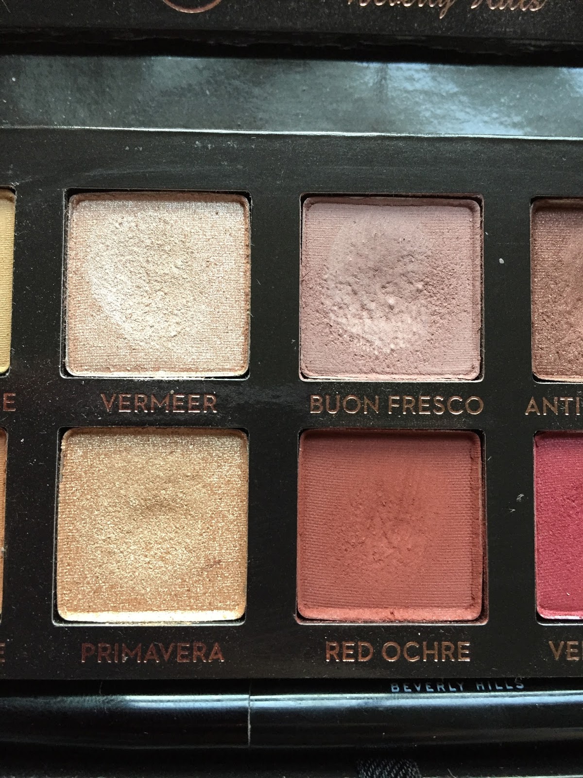
Top row, L-R: Tempera (look closely!), Golden Ochre, Vermeer, Buon Fresco, Antique Bronze, Love Letter, Cyprus Umber:

Bottom row, L-R: Raw Sienna, Burnt Orange, Primavera, Red Ochre, Venetian Red, Warm Taupe, Realgar:

Most of the shades are mattes, with the exceptions of two dazzling shimmers (Vermeer and Primavera) and two subtler shimmers (Antique Bronze and Venetian Red).
Let's turn to the individual shade names, most of which refer to paints and pigments. Many YouTubers who reviewed this palette last year made no effort to pronounce the names correctly, which kind of annoyed me. I don't expect everyone to have a comprehensive knowledge of Italian art history (I certainly don't), but if you're sent an expensive palette for free, the least you can do is look up the pronunciation of unfamiliar words. One well-known beauty guru said, and I quote: "This palette was inspired by Renaissance paintings, and I'm sure these are probably named after some paintings, or some people who made the paintings—who fucking knows, to be honest." Well, you might, if you did a 30-second Google search, but okay. I don't want to come off as a snob (though I'm sure that ship sailed long ago), but one of the most appealing aspects of this palette is the narrative that ABH created through its colors and shade names. If you take no interest in the names, you're missing out on part of the story, so I thought I'd introduce each shade with some information about its name. Not being an artist or art historian myself, I learned a lot while writing this post! Let's start with the four colors on the far left:

Tempera is a very pale beige that's slightly lighter than my skin. It's named after tempera paint, made by mixing pigments with a glutinous substance, usually egg yolk. Egg tempera dominated Renaissance art until the development of oil painting toward the end of the 15th century. Tempera is the one Modern Renaissance shade that falls short for me: it's drier and more powdery than the other shadows, though certainly workable. Here it is at left, next to Urban Decay Skimp (center) and Stark, both from the Naked2 Basics palette. Tempera is the most opaque of the three, but also the chalkiest.

Golden Ochre is a pale mustard brown. Ochre (or ocher, in American spelling) is an earth pigment derived from clay containing hydrated iron oxide, which gives it a yellow, orange, or red color. Ochre has been used in art since Paleolithic times; Renaissance artists generally used it in frescoes, mural paintings executed on wet plaster. The word "ochre" comes from the Greek ὠχρός, or "pale yellow."
Raw Sienna is a medium warm brown that looks darker and more orange on my lids than it does in the pan. Sienna is an earth pigment similar to, but darker than, yellow ochre. It takes its name from the Tuscan city-state of Siena, which was an independent republic from 1125 to 1555. The word "raw" distinguishes sienna in its natural state from heated or "burnt" sienna, which is darker and redder.
Burnt Orange is a light brownish orange. No real Renaissance significance to this name, alas.

Vermeer is an opaque peachy-pink shimmer. The name refers to Johannes Vermeer (1632-1675), a Dutch Baroque—not Renaissance—painter. It's bizarre that ABH named just one shade after a specific artist, and he's not even from the right era. Vermeer is known for his judicious use of light, which may explain why such a dazzling eyeshadow received his name. Here's Vermeer's Girl with a Red Hat, painted in the mid-1660s:

Buon Fresco is my favorite Modern Renaissance shade, a muted plummy browny pink reminiscent of ColourPop Bill. It's also sold as a single eyeshadow, if you don't feel like buying the entire palette but want a pink transition shade in your life. The term buon fresco refers to the Renaissance technique of painting on a wall of wet or "fresh" (fresco) plaster. Some frescoes are executed on dried plaster, but only wet-plaster painting is considered buon or "true" fresco. Michelangelo's Creation of Adam on the ceiling of the Sistine Chapel is probably the most famous example of buon fresco:

Primavera is a pale gold named after the aforementioned Botticelli painting, which now hangs in the Uffizi Gallery in Florence. The title, meaning "spring," was bestowed on the painting not by Botticelli but by the historian Giorgio Vasari four decades after Botticelli's death. Though the woman in the center probably represents Venus, the symbolism of the rest of the painting has been debated for centuries. The superiority of Primavera and Vermeer to similar shades from theBalm Nude 'tude, however, is less controversial. L-R: theBalm Stubborn, Vermeer, Primavera, theBalm Stand-offish:

Red Ochre is a deep reddish brown. The color of ochre varies depending on the minerals present in it; hematite turns ochre red. Red ochre has been used for cosmetics and body painting in many cultures and eras, including ancient Egypt.

Antique Bronze is my second favorite shade, a shimmery deep bronze that pulls more red than any other bronze eyeshadow I've encountered. Blended across the lid and into the crease, this is a great one-and-done shade. As the Met's website explains, the Renaissance interest in classical antiquities produced a craze for bronze sculpture, and "the lustrous reddish bronze of Florence set the standard." Here's a panel, depicting a mask of Medusa, from a 16th-century writing box:
I love bronze eyeshadows, so I had a few on hand for comparisons. L-R: Maybelline Pomegranate Punk, Antique Bronze, theBalm Sophisticated (Nude 'tude), Maybelline Bad to the Bronze. I was surprised to discover that Antique Bronze is closest by far to Pomegranate Punk.

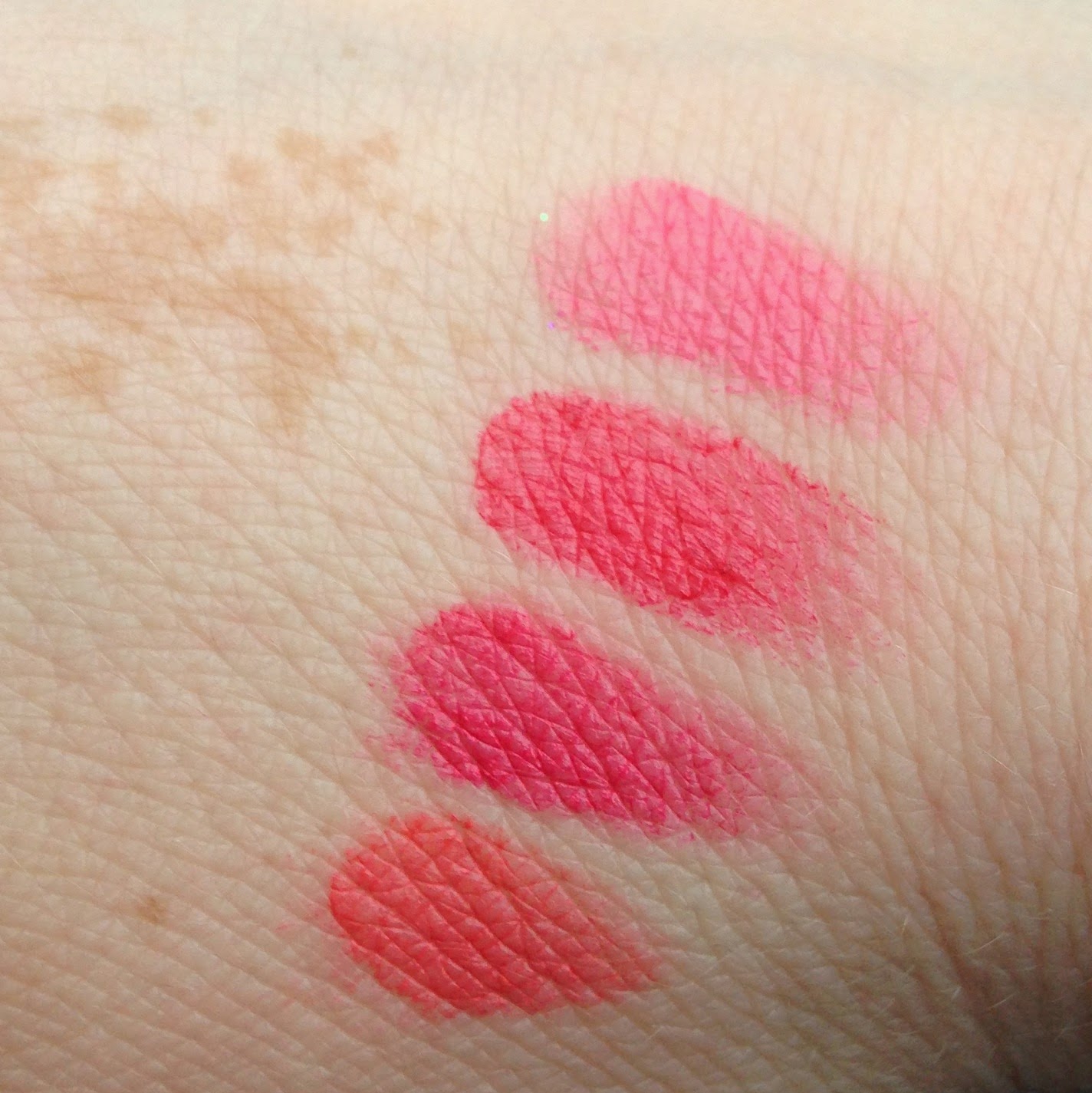
Love Letter is a bright berry fuchsia. As my swatch indicates, this shade isn't as opaque as most of the others. Frankly, I don't mind: this is the sort of color that I prefer to build up gradually. "Love Letter" is another generic name, though Renaissance literature is full of love letters, including this stanza from John Donne's "Valediction to His Book":
Warm Taupe is actually one of the coolest shades in the palette, a light grayish tan that works well as an all-over lid color. No specific allusions here, unfortunately, but I've done some comparison swatches. L-R: Warm Taupe, Urban Decay Cover (Naked2 Basics), theBalm Sultry (Nude 'tude), Raw Sienna:

Almost done!

Cyprus Umber is a cool dark brown, named after yet another earth pigment: umber, which is darker than ochre and sienna but similarly colored with iron oxide. The word "umber" is derived from the Italian region of Umbria. Like "Vermeer," this shade name is slightly inaccurate: umbers appear less often in Renaissance paintings than in the darker, moodier art of the Baroque period.
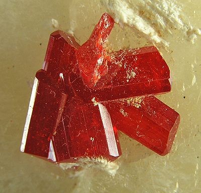
Finally, Realgar (pronounced "ree-AL-gar": yes, I had to look that up) is a rich orange with a hint of brown. Realgar is a bright red or orange arsenic mineral that was used in red paint from ancient Rome until the 18th century. Here, courtesy of Wikipedia, is a cluster of realgar crystals:
The Modern Renaissance shadows have a very soft and pigmented formula that kicks up a ridiculous amount of powder with the slightest tap of the brush. I feel wasteful every time I have to blow away excess powder, but so it goes; I suppose there's a reason why people are hitting pan on these shadows so quickly. The pigment also clings very hard to my brushes, which I've had to wash weekly since I started using this palette. In general, I prefer semi-sheer eyeshadows that can be built up to opacity (NARS Lhasa is a good example), but I've been enjoying the Modern Renaissance formula as well. It blends out smoothly and evenly, giving the impression that I'm better at eyeshadow than I actually am. I do have trouble blending it into the deep creases that run across my lids, but I encounter that problem with almost every powder eyeshadow. Because they're so pigmented, the MR shadows can collect in the creases instead of blending softly over and through them as my sheerer shadows do.
Maybe it's because I have no experience of fancy brushes, but I really like the two-headed brush that comes with the palette. The larger head has long, floppy bristles that work well to blend out the crease, while the smaller head is good for packing shimmer into the inner corner.
Having owned this palette for almost two months now, I've tried out more looks than I can feasibly include in one blog post, so here are my best attempts. I'm pleased to report that Modern Renaissance cooperates beautifully with my usual taste for boring, work-appropriate eye looks, though I've tried out some dramatic smoky eyes as well. First, here's my Valentine's Day look, featuring an all-over base of Tempera; Buon Fresco and Love Letter in the crease; a blend of Venetian Red and Love Letter on the outer half of the lid, with Cyprus Umber in the outer corners; Tempera on the inner half of the lid, with Vermeer in the inner corners; and more Cyprus Umber on the lower lashlines. Phew. My blush is Threesome from the NARS Pop Goes the Easel collection (more on that in a future post), and my lipstick is Bourjois Rouge Edition in Beige Trench. I'm still not totally satisfied with my blending skills, but I suppose that's what practice is for. I made the mistake of wearing this look to Hidden Figures, which made me tear up no fewer than four times, and I'm not even a movie crier. D:

Closeup of an earlier iteration: same crease combination and inner-corner highlight, but with Love Letter and Cyprus Umber in the outer corner, Buon Fresco on the lid, and Antique Bronze on the lower lashline. I think I like this version better.

My first attempt at a halo eye: Raw Sienna in the crease, Red Ochre and Cyprus Umber in the inner and outer corners, and Primavera in the center, plus an annoying stray hair. In future halo eyes, I think I'll concentrate the highlight shade on a smaller area of lid.

Burnt Orange and Realgar in the crease, Antique Bronze on the outer half of the lid and lower lashline, Raw Sienna on the rest of the lid:

Finally, one of the subtler looks that constitute 75% of my use of this palette. Buon Fresco and Antique Bronze in the crease, Antique Bronze on the outer lid and lower lashline, and Tempera on the rest of the lid. My other color makeup is Illamasqua Zygomatic blush, ColourPop Lunch Money highlighter, and Revlon Matte Balm in Fierce.

Well, that took me forever to write. The main conclusions you should take from this post are that Modern Renaissance is 1) really great; 2) really Renaissance, though not as Renaissance as it could be; 3) never mind the rest, I just drank a huge French 75 and I'm pretty tipsy. Happy Valentine's Day, everyone!
- I have a hipster distaste for any product that receives a tremendous amount of hype. (Preteen me held out on the Harry Potter novels for at least a year because ~everyone else~ liked them.)
- Historically, I've preferred eyeshadow singles to palettes: more travel-friendly, less visually intimidating.
- My skin, hair, and eyes are all cool-toned.
- I wear simple neutral eye looks almost every day and didn't trust myself to use the bolder colors in the palette.
- I'd never tried anything by Anastasia Beverly Hills and had no idea what to expect from the brand.
- $42 was more money than I'd ever spent on a beauty product.
I was going to use a photo of my palette in its pristine state, but I thought it would be more interesting to upload one that reflects its current usage, since I love seeing how different people favor different shades. Just as every pedestrian draws her own map of a city, so every makeup user finds her own way through Modern Renaissance. Predictably, I've given the most love to the cooler-toned shades—Buon Fresco, Antique Bronze, Cyprus Umber, and Warm Taupe—but I've used every shade at least twice:

There are a zillion Modern Renaissance reviews on the internet, so I thought I'd make mine different by posing a question that I haven't seen asked yet: How Renaissance is Modern Renaissance? Let's begin with the outside, which features a blush-pink fuzzy felted surface with white lettering. I've done my best to prevent the pink felt from getting grubby (traveling with the palette in a Ziploc bag, etc), but as many reviewers have discovered before me, it's a losing battle.

You know what isn't remotely Renaissance? That boring white sans-serif typeface. Here's a typical Renaissance title page:

Yes, this is a very trivial and nerdy quibble, but any of the typefaces above would have been more interesting than the one Anastasia used. If you're going to name a palette "Modern Renaissance," establishing conceptual continuity through little details like font is a good idea.
Now, how Renaissance is the overall color scheme? Let's assume that the word "Renaissance" applies to the art produced between, say, 1400 and 1600 (the Renaissance began and ended in Italy much earlier than it did in northern Europe, including England). One of the shade names alludes to an iconic Italian Renaissance painting, Sandro Botticelli's Primavera (c. 1482):

Modern Renaissance's color story is a skillful adaptation of Botticelli's, from the warm golden hair of the female figures (Raw Sienna and Burnt Orange), to the vivid orange robe (Realgar), to the leftmost figure's drapery (Venetian Red) and sandals (Cyprus Umber). So far, so Renaissance; now for some swatches. I've made each swatch below by swiping my finger once across the pan and once across my arm.
Top row, L-R: Tempera (look closely!), Golden Ochre, Vermeer, Buon Fresco, Antique Bronze, Love Letter, Cyprus Umber:

Bottom row, L-R: Raw Sienna, Burnt Orange, Primavera, Red Ochre, Venetian Red, Warm Taupe, Realgar:

Most of the shades are mattes, with the exceptions of two dazzling shimmers (Vermeer and Primavera) and two subtler shimmers (Antique Bronze and Venetian Red).
Let's turn to the individual shade names, most of which refer to paints and pigments. Many YouTubers who reviewed this palette last year made no effort to pronounce the names correctly, which kind of annoyed me. I don't expect everyone to have a comprehensive knowledge of Italian art history (I certainly don't), but if you're sent an expensive palette for free, the least you can do is look up the pronunciation of unfamiliar words. One well-known beauty guru said, and I quote: "This palette was inspired by Renaissance paintings, and I'm sure these are probably named after some paintings, or some people who made the paintings—who fucking knows, to be honest." Well, you might, if you did a 30-second Google search, but okay. I don't want to come off as a snob (though I'm sure that ship sailed long ago), but one of the most appealing aspects of this palette is the narrative that ABH created through its colors and shade names. If you take no interest in the names, you're missing out on part of the story, so I thought I'd introduce each shade with some information about its name. Not being an artist or art historian myself, I learned a lot while writing this post! Let's start with the four colors on the far left:

Tempera is a very pale beige that's slightly lighter than my skin. It's named after tempera paint, made by mixing pigments with a glutinous substance, usually egg yolk. Egg tempera dominated Renaissance art until the development of oil painting toward the end of the 15th century. Tempera is the one Modern Renaissance shade that falls short for me: it's drier and more powdery than the other shadows, though certainly workable. Here it is at left, next to Urban Decay Skimp (center) and Stark, both from the Naked2 Basics palette. Tempera is the most opaque of the three, but also the chalkiest.

Golden Ochre is a pale mustard brown. Ochre (or ocher, in American spelling) is an earth pigment derived from clay containing hydrated iron oxide, which gives it a yellow, orange, or red color. Ochre has been used in art since Paleolithic times; Renaissance artists generally used it in frescoes, mural paintings executed on wet plaster. The word "ochre" comes from the Greek ὠχρός, or "pale yellow."
Raw Sienna is a medium warm brown that looks darker and more orange on my lids than it does in the pan. Sienna is an earth pigment similar to, but darker than, yellow ochre. It takes its name from the Tuscan city-state of Siena, which was an independent republic from 1125 to 1555. The word "raw" distinguishes sienna in its natural state from heated or "burnt" sienna, which is darker and redder.
Burnt Orange is a light brownish orange. No real Renaissance significance to this name, alas.
Vermeer is an opaque peachy-pink shimmer. The name refers to Johannes Vermeer (1632-1675), a Dutch Baroque—not Renaissance—painter. It's bizarre that ABH named just one shade after a specific artist, and he's not even from the right era. Vermeer is known for his judicious use of light, which may explain why such a dazzling eyeshadow received his name. Here's Vermeer's Girl with a Red Hat, painted in the mid-1660s:

Buon Fresco is my favorite Modern Renaissance shade, a muted plummy browny pink reminiscent of ColourPop Bill. It's also sold as a single eyeshadow, if you don't feel like buying the entire palette but want a pink transition shade in your life. The term buon fresco refers to the Renaissance technique of painting on a wall of wet or "fresh" (fresco) plaster. Some frescoes are executed on dried plaster, but only wet-plaster painting is considered buon or "true" fresco. Michelangelo's Creation of Adam on the ceiling of the Sistine Chapel is probably the most famous example of buon fresco:

Primavera is a pale gold named after the aforementioned Botticelli painting, which now hangs in the Uffizi Gallery in Florence. The title, meaning "spring," was bestowed on the painting not by Botticelli but by the historian Giorgio Vasari four decades after Botticelli's death. Though the woman in the center probably represents Venus, the symbolism of the rest of the painting has been debated for centuries. The superiority of Primavera and Vermeer to similar shades from theBalm Nude 'tude, however, is less controversial. L-R: theBalm Stubborn, Vermeer, Primavera, theBalm Stand-offish:

Red Ochre is a deep reddish brown. The color of ochre varies depending on the minerals present in it; hematite turns ochre red. Red ochre has been used for cosmetics and body painting in many cultures and eras, including ancient Egypt.

Antique Bronze is my second favorite shade, a shimmery deep bronze that pulls more red than any other bronze eyeshadow I've encountered. Blended across the lid and into the crease, this is a great one-and-done shade. As the Met's website explains, the Renaissance interest in classical antiquities produced a craze for bronze sculpture, and "the lustrous reddish bronze of Florence set the standard." Here's a panel, depicting a mask of Medusa, from a 16th-century writing box:
 |
| Source: Metropolitan Museum of Art |
I love bronze eyeshadows, so I had a few on hand for comparisons. L-R: Maybelline Pomegranate Punk, Antique Bronze, theBalm Sophisticated (Nude 'tude), Maybelline Bad to the Bronze. I was surprised to discover that Antique Bronze is closest by far to Pomegranate Punk.

Love Letter is a bright berry fuchsia. As my swatch indicates, this shade isn't as opaque as most of the others. Frankly, I don't mind: this is the sort of color that I prefer to build up gradually. "Love Letter" is another generic name, though Renaissance literature is full of love letters, including this stanza from John Donne's "Valediction to His Book":
Study our manuscripts, those myriadsVenetian Red is a slightly shimmery berry red that looks warm in the pan but pinker on the lids. The name refers to a pigment derived from ferric oxide, i.e. hematite, the same mineral that colors red ochre.
Of letters, which have past 'twixt thee and me;
Thence write our annals, and in them will be
To all whom love's subliming fire invades,
Rule and example found;
There the faith of any ground
No schismatic will dare to wound,
That sees, how Love this grace to us affords,
To make, to keep, to use, to be these his records.
Warm Taupe is actually one of the coolest shades in the palette, a light grayish tan that works well as an all-over lid color. No specific allusions here, unfortunately, but I've done some comparison swatches. L-R: Warm Taupe, Urban Decay Cover (Naked2 Basics), theBalm Sultry (Nude 'tude), Raw Sienna:

Almost done!

Cyprus Umber is a cool dark brown, named after yet another earth pigment: umber, which is darker than ochre and sienna but similarly colored with iron oxide. The word "umber" is derived from the Italian region of Umbria. Like "Vermeer," this shade name is slightly inaccurate: umbers appear less often in Renaissance paintings than in the darker, moodier art of the Baroque period.
Finally, Realgar (pronounced "ree-AL-gar": yes, I had to look that up) is a rich orange with a hint of brown. Realgar is a bright red or orange arsenic mineral that was used in red paint from ancient Rome until the 18th century. Here, courtesy of Wikipedia, is a cluster of realgar crystals:
 |
| Source |
The Modern Renaissance shadows have a very soft and pigmented formula that kicks up a ridiculous amount of powder with the slightest tap of the brush. I feel wasteful every time I have to blow away excess powder, but so it goes; I suppose there's a reason why people are hitting pan on these shadows so quickly. The pigment also clings very hard to my brushes, which I've had to wash weekly since I started using this palette. In general, I prefer semi-sheer eyeshadows that can be built up to opacity (NARS Lhasa is a good example), but I've been enjoying the Modern Renaissance formula as well. It blends out smoothly and evenly, giving the impression that I'm better at eyeshadow than I actually am. I do have trouble blending it into the deep creases that run across my lids, but I encounter that problem with almost every powder eyeshadow. Because they're so pigmented, the MR shadows can collect in the creases instead of blending softly over and through them as my sheerer shadows do.
Maybe it's because I have no experience of fancy brushes, but I really like the two-headed brush that comes with the palette. The larger head has long, floppy bristles that work well to blend out the crease, while the smaller head is good for packing shimmer into the inner corner.
Having owned this palette for almost two months now, I've tried out more looks than I can feasibly include in one blog post, so here are my best attempts. I'm pleased to report that Modern Renaissance cooperates beautifully with my usual taste for boring, work-appropriate eye looks, though I've tried out some dramatic smoky eyes as well. First, here's my Valentine's Day look, featuring an all-over base of Tempera; Buon Fresco and Love Letter in the crease; a blend of Venetian Red and Love Letter on the outer half of the lid, with Cyprus Umber in the outer corners; Tempera on the inner half of the lid, with Vermeer in the inner corners; and more Cyprus Umber on the lower lashlines. Phew. My blush is Threesome from the NARS Pop Goes the Easel collection (more on that in a future post), and my lipstick is Bourjois Rouge Edition in Beige Trench. I'm still not totally satisfied with my blending skills, but I suppose that's what practice is for. I made the mistake of wearing this look to Hidden Figures, which made me tear up no fewer than four times, and I'm not even a movie crier. D:

Closeup of an earlier iteration: same crease combination and inner-corner highlight, but with Love Letter and Cyprus Umber in the outer corner, Buon Fresco on the lid, and Antique Bronze on the lower lashline. I think I like this version better.

My first attempt at a halo eye: Raw Sienna in the crease, Red Ochre and Cyprus Umber in the inner and outer corners, and Primavera in the center, plus an annoying stray hair. In future halo eyes, I think I'll concentrate the highlight shade on a smaller area of lid.

Burnt Orange and Realgar in the crease, Antique Bronze on the outer half of the lid and lower lashline, Raw Sienna on the rest of the lid:

Finally, one of the subtler looks that constitute 75% of my use of this palette. Buon Fresco and Antique Bronze in the crease, Antique Bronze on the outer lid and lower lashline, and Tempera on the rest of the lid. My other color makeup is Illamasqua Zygomatic blush, ColourPop Lunch Money highlighter, and Revlon Matte Balm in Fierce.

Well, that took me forever to write. The main conclusions you should take from this post are that Modern Renaissance is 1) really great; 2) really Renaissance, though not as Renaissance as it could be; 3) never mind the rest, I just drank a huge French 75 and I'm pretty tipsy. Happy Valentine's Day, everyone!


Comments
Post a Comment