Beauty Abroad, Part 20: Barry M Nail Paints in Butterscotch Sundae, Damson, and Vintage Violet
I thought I'd post more after returning from England, but instead I've spent most of my time agonizing over a dissertation chapter that I'm revising (well, basically rewriting). You know that feeling when you read over an unfinished piece of writing one too many times, and suddenly it seems to dissolve before your very eyes, and you're no longer sure whether you've made an argument or even written coherent, grammatical sentences? And then you start questioning the very foundations of your knowledge and reach the conclusion that you don't know how to write about anything and in fact have never known? Yeah. Experience has taught me that the only thing that helps once I reach this point is taking a break, and I'm lucky enough to have the liberty of taking breaks when I need them. Here's hoping that writing about nail polish will clear my head.
Let me introduce you to the three Barry M nail polishes (sorry, "Nail Paints") that I bought in England last month. L-R: Vintage Violet, Damson, Butterscotch Sundae.

Vintage Violet comes in the original ("Classic") Nail Paint formula, while Damson and Butterscotch Sundae belong to the "Gelly Hi-Shine" line, which is shinier and longer-lasting (and slightly more expensive) than the core line. The Classic Nail Paints retail for £2.99 (that's a mere $3.89 in these post-Brexit days), while the Gelly Hi-Shine polishes are £3.99 ($5.18), though I got Damson and Butterscotch Sundae in a 2-for-£5 sale. Barry M bottles are on the small side: 10 ml (0.35 fl oz) each, as opposed to 15 ml for OPI and Zoya, 13.5 for Essie, 13 for Chanel, 12 for Formula X, and 11 for Butter London (might as well be thorough).
It's worth noting that the Classic shades have a normal-looking round brush, but the Gelly Hi-Shine shades have a wide flattened brush. My nails are quite narrow, but I still find the flattened brush convenient for covering the nail in fewer swipes than usual. That's the brush for Vintage Violet on the right, and for Butterscotch Sundae on the left.

While mulling over the direction of this blog post, I realized that all three shades seemed quintessentially English to me. Butterscotch Sundae and Damson reminded me of two colors I'd seen repeatedly during my visit: the warm off-white of clotted cream (I ate a lot of clotted cream) and the brilliant blue of stained glass. I don't associate Vintage Violet with one particular object, but its bruised-plum hue recalls the constant cloud cover and the overall political mood of last month in the UK. (I hear it was a particularly wet June, not that I needed independent verification.) I'm thinking of scenes like this one, from the Winterbourne Botanic Garden at the University of Birmingham:

Vintage Violet is a beautiful color, a somber taupey purple, but it pulls darker and grayer on the nails than it appears in the bottle. I was hoping for a lighter shade than my two other murky purples (murples?), but Vintage Violet is pretty similar to them when worn. I need to buy one of those plastic nail-swatch wheels, because photographing a bunch of bottles together isn't particularly helpful, but this is the best I can do for now. L-R: Vintage Violet, Zoya Normani, Essie Smokin' Hot.

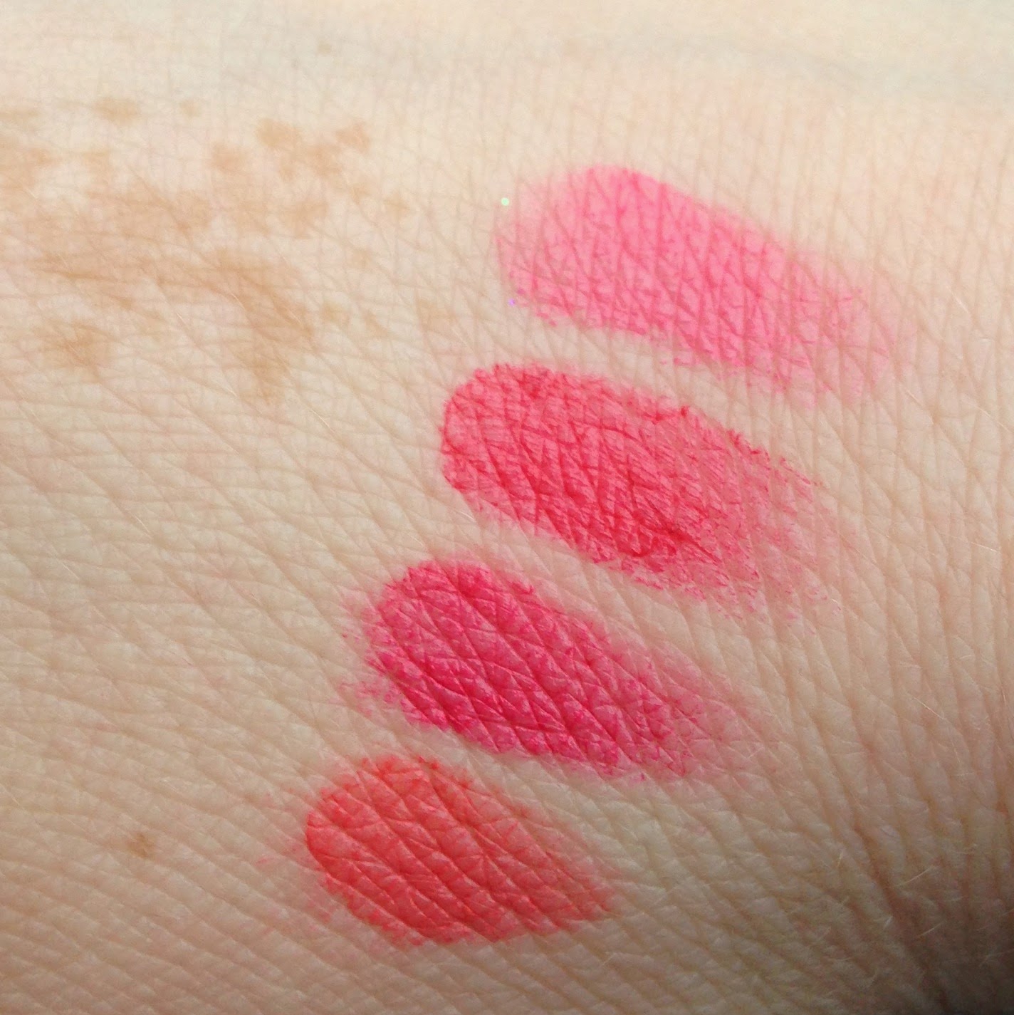
Vintage Violet needs three coats for full opacity. It's a bit closer to true purple than the other two, but only a bit:

The bigger problem is that Vintage Violet is as chip-prone as the other Barry M Classic shade I've tried, Shocking Pink. I've worn it only once, but it chipped after a day and a half, so I wasn't exactly tempted to wear it again. I wouldn't say I regret this purchase, exactly, but it turned out to be less unique than I thought. It's good to keep in mind that the minuscule shade variations that we beauty junkies obsess over are invisible to 99.9% of the population. If I wore Vintage Violet on Monday, Smokin' Hot on Tuesday, and Normani on Wednesday, no one would notice that I was changing my polish every night like a weirdo. And while I don't really care who notices that I'm changing my polish or lipstick or whatever, the fact is that when I'm out and about in the world, I don't notice those shade variations either. A bright pink lipstick puts me in a certain mood, and it doesn't really matter whether that lipstick is MAC Candy Yum-Yum or Maybelline Vivid Rose, even if Candy Yum-Yum is brighter and more matte than Vivid Rose. You know?
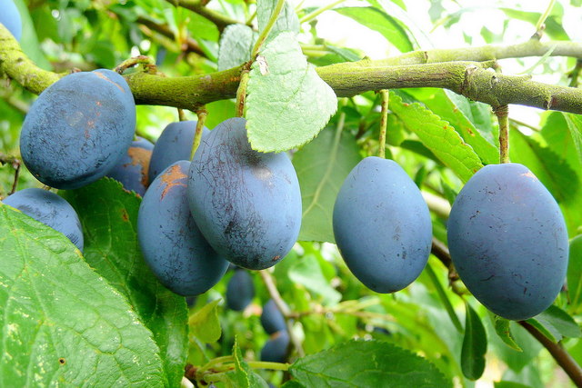
On to a purchase I'm happier with: Damson, a bright blue that I bought as a replacement for my dried-up OPI Eurso Euro. In the bottle, Damson is just a bit lighter than the storied International Klein Blue, but like Vintage Violet it turns darker on the nails, and it could pass for IKB in bright sunlight:

A damson, by the way, is a true British delicacy: a small, sour fruit related to the plum (its name comes from the Middle English damascene or "Damascus plum"). It's used mainly in jam and flavored gin, and its color has nothing in common with its Barry M namesake:

Far closer to Barry M Damson is the blue used for stained-glass windows in cathedrals all over the UK. Here's a stunning example from Canterbury Cathedral:

And a watery stained-glass reflection in the Jacobean chapel at Wadham College, Oxford (students there are actually called "Wadhamites," lololol):

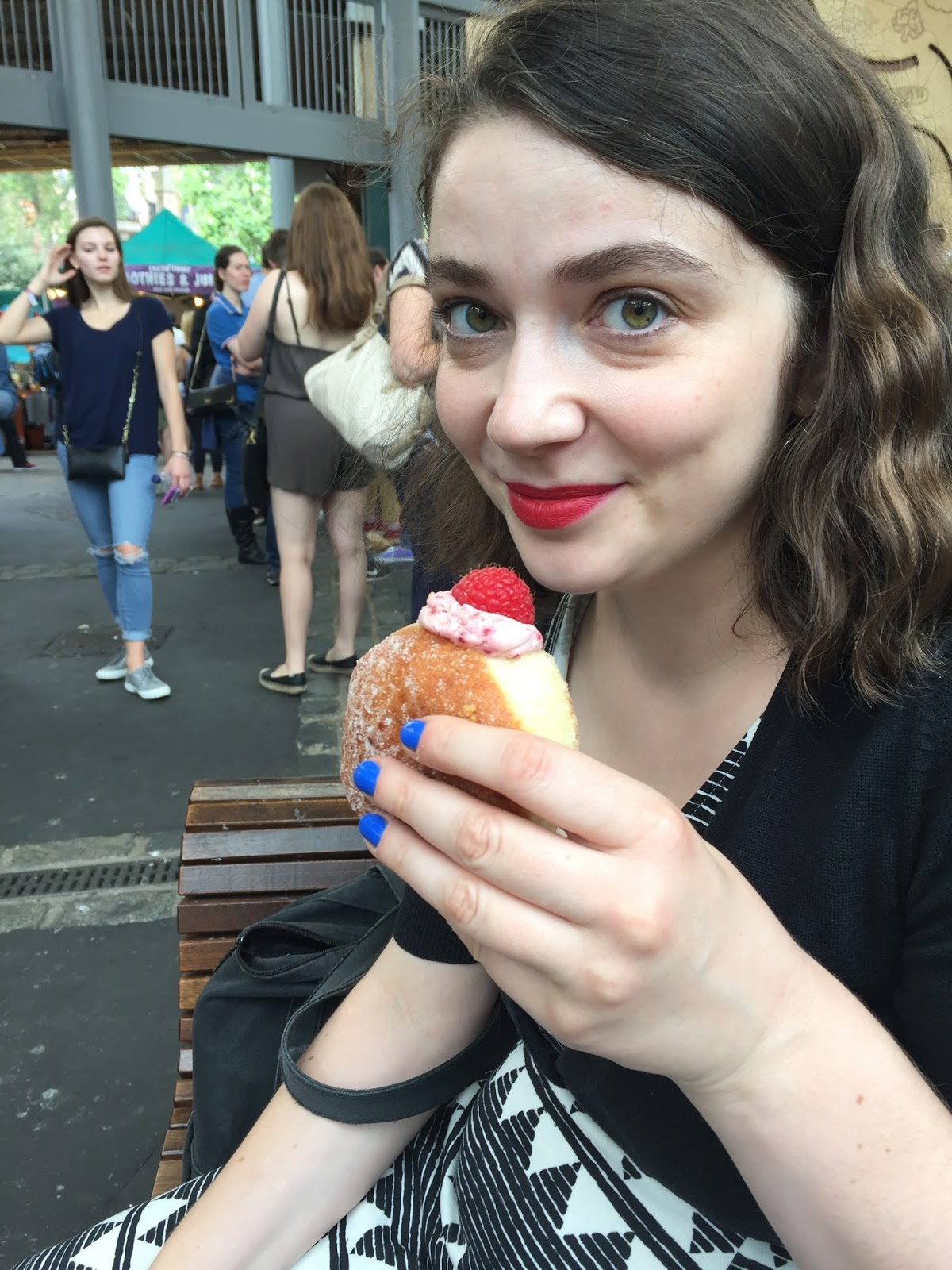
And here's an unflattering photo featuring Damson in action at London's Borough Market, just before I sank my whole face into a raspberry-cream donut from Bread Ahead:

Opaque in two coats, Damson lasts about three days without chipping, which is average for me. More importantly, it's a color that makes me happy every time I glance at my nails. As you know, I'm obsessive about seasonal makeup and polish, but medium and dark blues are year-round shades for me. I'm wearing Damson on my toes right now, because even ugly ballet-veteran feet deserve pedicures.
Finally, my favorite of the three: Butterscotch Sundae, an all-but-white beige. This will be a hard one to write about, since I've been vegan for the past week and have three days to go before I can eat an actual butterscotch sundae (don't worry, this one from a fancy pub in Kensington was shared between five people):

Butterscotch Sundae is one of Barry M's four new Hi-Shine shades for Spring 2016 (see the other three swatched here). Three of the four verge on white: along with Butterscotch Sundae, there's Pink Lemonade, a very pale pink, and Cream Soda, a cool-toned off-white with a hint of yellow-green. I've long fantasized about some brand releasing a collection of non-streaky almost-white polishes: there could be a white with a hint of gray, a blue-toned white, a slightly creamy yellow-white...Until that happens, Barry M's new collection is the closest we'll get.
Butterscotch Sundae needs three coats for opacity, but it goes on smoothly and isn't streaky at all. It lasts about as long as Damson, though the formula is a bit thicker, as pastels often are.

I love how this shade looks against my skin—so clean and calming. It's also a great base for glitter, as I discovered a few days ago. I put down two coats of Butterscotch Sundae (not quite opaque, but close enough), followed by two coats of Mod Lacquer Nonpareils, a rainbow glitter in a sheer white base:

I ordered Nonpareils from Mod Lacquer's Etsy shop about three years ago. Mod Lacquer later reformulated Nonpareils to have more glitter per swipe—not that that information is much good to anyone now, since the brand sadly closed up shop last year. They had a nice assortment of bright playful colors with contrasting glitters (yellow with teal glitter is a combo I remember coveting), but I guess there's a lot of competition out there for any indie brand. Nonpareils is a great layering polish for whites and pastels because its base is so sheer, but it does take a looooong time to dry—like, 30 minutes per coat. Luckily, the result is worth the faff:


But let's talk about clotted cream for a second. For those who have the ill fortune to be unacquainted with this delight, it's full-fat cream that has been heated and cooled to produce a stretchy, gooey, almost chewy consistency. Originally from Cornwall and Devon, clotted cream is served with scones and (usually strawberry) jam for the traditional British cream tea. Wikipedia notes that "the regular consumption of clotted cream is usually thought to be bad for health," which is right up there on the understatement scale with "the Scots are a tiny bit irritated at the Brexit result," but there's no denying that clotted cream is very good for mental health. Look at this perfect orb of dairy from London's Savoy Hotel:

As I discovered after posting a photo of a cream tea on Instagram, the order in which cream and jam are placed on a scone is a divisive issue. I favor the Devon method (cream first), but the Cornwall method (jam first) has its merits as well. Jam first means that the cream smears the jam around and the two get mixed together, which is inferior aesthetically but produces a nice blend of flavors. This cream tea à la Devon is from the Edwardian Tearoom at the Birmingham Museum of Art:

Yes, Butterscotch Sundae is a tiny bit pinker than clotted cream, but I think of cream tea whenever I wear it. I don't know, guys, I may not be cut out for veganism.
Let me introduce you to the three Barry M nail polishes (sorry, "Nail Paints") that I bought in England last month. L-R: Vintage Violet, Damson, Butterscotch Sundae.

Vintage Violet comes in the original ("Classic") Nail Paint formula, while Damson and Butterscotch Sundae belong to the "Gelly Hi-Shine" line, which is shinier and longer-lasting (and slightly more expensive) than the core line. The Classic Nail Paints retail for £2.99 (that's a mere $3.89 in these post-Brexit days), while the Gelly Hi-Shine polishes are £3.99 ($5.18), though I got Damson and Butterscotch Sundae in a 2-for-£5 sale. Barry M bottles are on the small side: 10 ml (0.35 fl oz) each, as opposed to 15 ml for OPI and Zoya, 13.5 for Essie, 13 for Chanel, 12 for Formula X, and 11 for Butter London (might as well be thorough).
It's worth noting that the Classic shades have a normal-looking round brush, but the Gelly Hi-Shine shades have a wide flattened brush. My nails are quite narrow, but I still find the flattened brush convenient for covering the nail in fewer swipes than usual. That's the brush for Vintage Violet on the right, and for Butterscotch Sundae on the left.

While mulling over the direction of this blog post, I realized that all three shades seemed quintessentially English to me. Butterscotch Sundae and Damson reminded me of two colors I'd seen repeatedly during my visit: the warm off-white of clotted cream (I ate a lot of clotted cream) and the brilliant blue of stained glass. I don't associate Vintage Violet with one particular object, but its bruised-plum hue recalls the constant cloud cover and the overall political mood of last month in the UK. (I hear it was a particularly wet June, not that I needed independent verification.) I'm thinking of scenes like this one, from the Winterbourne Botanic Garden at the University of Birmingham:

Vintage Violet is a beautiful color, a somber taupey purple, but it pulls darker and grayer on the nails than it appears in the bottle. I was hoping for a lighter shade than my two other murky purples (murples?), but Vintage Violet is pretty similar to them when worn. I need to buy one of those plastic nail-swatch wheels, because photographing a bunch of bottles together isn't particularly helpful, but this is the best I can do for now. L-R: Vintage Violet, Zoya Normani, Essie Smokin' Hot.

Vintage Violet needs three coats for full opacity. It's a bit closer to true purple than the other two, but only a bit:

The bigger problem is that Vintage Violet is as chip-prone as the other Barry M Classic shade I've tried, Shocking Pink. I've worn it only once, but it chipped after a day and a half, so I wasn't exactly tempted to wear it again. I wouldn't say I regret this purchase, exactly, but it turned out to be less unique than I thought. It's good to keep in mind that the minuscule shade variations that we beauty junkies obsess over are invisible to 99.9% of the population. If I wore Vintage Violet on Monday, Smokin' Hot on Tuesday, and Normani on Wednesday, no one would notice that I was changing my polish every night like a weirdo. And while I don't really care who notices that I'm changing my polish or lipstick or whatever, the fact is that when I'm out and about in the world, I don't notice those shade variations either. A bright pink lipstick puts me in a certain mood, and it doesn't really matter whether that lipstick is MAC Candy Yum-Yum or Maybelline Vivid Rose, even if Candy Yum-Yum is brighter and more matte than Vivid Rose. You know?
On to a purchase I'm happier with: Damson, a bright blue that I bought as a replacement for my dried-up OPI Eurso Euro. In the bottle, Damson is just a bit lighter than the storied International Klein Blue, but like Vintage Violet it turns darker on the nails, and it could pass for IKB in bright sunlight:

A damson, by the way, is a true British delicacy: a small, sour fruit related to the plum (its name comes from the Middle English damascene or "Damascus plum"). It's used mainly in jam and flavored gin, and its color has nothing in common with its Barry M namesake:
Far closer to Barry M Damson is the blue used for stained-glass windows in cathedrals all over the UK. Here's a stunning example from Canterbury Cathedral:

And a watery stained-glass reflection in the Jacobean chapel at Wadham College, Oxford (students there are actually called "Wadhamites," lololol):

And here's an unflattering photo featuring Damson in action at London's Borough Market, just before I sank my whole face into a raspberry-cream donut from Bread Ahead:
Opaque in two coats, Damson lasts about three days without chipping, which is average for me. More importantly, it's a color that makes me happy every time I glance at my nails. As you know, I'm obsessive about seasonal makeup and polish, but medium and dark blues are year-round shades for me. I'm wearing Damson on my toes right now, because even ugly ballet-veteran feet deserve pedicures.
Finally, my favorite of the three: Butterscotch Sundae, an all-but-white beige. This will be a hard one to write about, since I've been vegan for the past week and have three days to go before I can eat an actual butterscotch sundae (don't worry, this one from a fancy pub in Kensington was shared between five people):

Butterscotch Sundae is one of Barry M's four new Hi-Shine shades for Spring 2016 (see the other three swatched here). Three of the four verge on white: along with Butterscotch Sundae, there's Pink Lemonade, a very pale pink, and Cream Soda, a cool-toned off-white with a hint of yellow-green. I've long fantasized about some brand releasing a collection of non-streaky almost-white polishes: there could be a white with a hint of gray, a blue-toned white, a slightly creamy yellow-white...Until that happens, Barry M's new collection is the closest we'll get.
Butterscotch Sundae needs three coats for opacity, but it goes on smoothly and isn't streaky at all. It lasts about as long as Damson, though the formula is a bit thicker, as pastels often are.

I love how this shade looks against my skin—so clean and calming. It's also a great base for glitter, as I discovered a few days ago. I put down two coats of Butterscotch Sundae (not quite opaque, but close enough), followed by two coats of Mod Lacquer Nonpareils, a rainbow glitter in a sheer white base:

I ordered Nonpareils from Mod Lacquer's Etsy shop about three years ago. Mod Lacquer later reformulated Nonpareils to have more glitter per swipe—not that that information is much good to anyone now, since the brand sadly closed up shop last year. They had a nice assortment of bright playful colors with contrasting glitters (yellow with teal glitter is a combo I remember coveting), but I guess there's a lot of competition out there for any indie brand. Nonpareils is a great layering polish for whites and pastels because its base is so sheer, but it does take a looooong time to dry—like, 30 minutes per coat. Luckily, the result is worth the faff:


But let's talk about clotted cream for a second. For those who have the ill fortune to be unacquainted with this delight, it's full-fat cream that has been heated and cooled to produce a stretchy, gooey, almost chewy consistency. Originally from Cornwall and Devon, clotted cream is served with scones and (usually strawberry) jam for the traditional British cream tea. Wikipedia notes that "the regular consumption of clotted cream is usually thought to be bad for health," which is right up there on the understatement scale with "the Scots are a tiny bit irritated at the Brexit result," but there's no denying that clotted cream is very good for mental health. Look at this perfect orb of dairy from London's Savoy Hotel:

As I discovered after posting a photo of a cream tea on Instagram, the order in which cream and jam are placed on a scone is a divisive issue. I favor the Devon method (cream first), but the Cornwall method (jam first) has its merits as well. Jam first means that the cream smears the jam around and the two get mixed together, which is inferior aesthetically but produces a nice blend of flavors. This cream tea à la Devon is from the Edwardian Tearoom at the Birmingham Museum of Art:

Yes, Butterscotch Sundae is a tiny bit pinker than clotted cream, but I think of cream tea whenever I wear it. I don't know, guys, I may not be cut out for veganism.
£ 2.99


Comments
Post a Comment